Shop 2, 14-20 Gardeners Road Kingsford, NSW, 2032
Six decades ago, newly married couple, Richard and Corinne Pepper, bought a modest family home in the Sydney suburb of Greystanes. They lived there ever since.
Despite raising two children in the home, both of whom subsequently moved out and started families of their own, Richard and Corinne did very little to update the home’s interior over the years. As such, it remained very much in its original condition—with original ‘pig hair’ carpets, floral wallpaper, and even an outside toilet.
A few years ago, Richard and Corinne made the decision to sell this much-loved Greystanes home so they could move to Canberra and be closer to their children and grandchildren. However, their home remained on the market for an agonising five months and received absolutely no offers in this time. Even though Greystanes is an in-demand suburb due to its proximity to Parramatta, the home—in its existing state—was being perceived as a ‘knock down’ that offered little more than land value.
Desperate to sell and start the next chapter of their lives, the couple called in the team at Selling Houses Australia for help. Hoping for a sale price of just over $1 million, the family contributed $60,000 towards their much-needed renovation.
Despite its dated interiors and layout, this small fibro home had a very warm and inviting feel. It had been a very special place for Richard and Corinne, as well as their children Jason and Alison, and every element of the interior had a story to tell.
For this reason, when planning the design, Wendy decided to modernise key elements, yet retain as much of home’s 1960s character as possible. This involved adding pops of bright colour, keeping some of the retro lighting, creating curved surfaces, and installing wallpaper. The frame from the existing kitchen bench was also kept and cleverly turned into a stand for a new, modern letterbox at the front of the home.
Wendy’s top priority in this re-design was extending the living space to create more of an open plan layout, and ensuring a more seamless connection with the kitchen and the back yard.
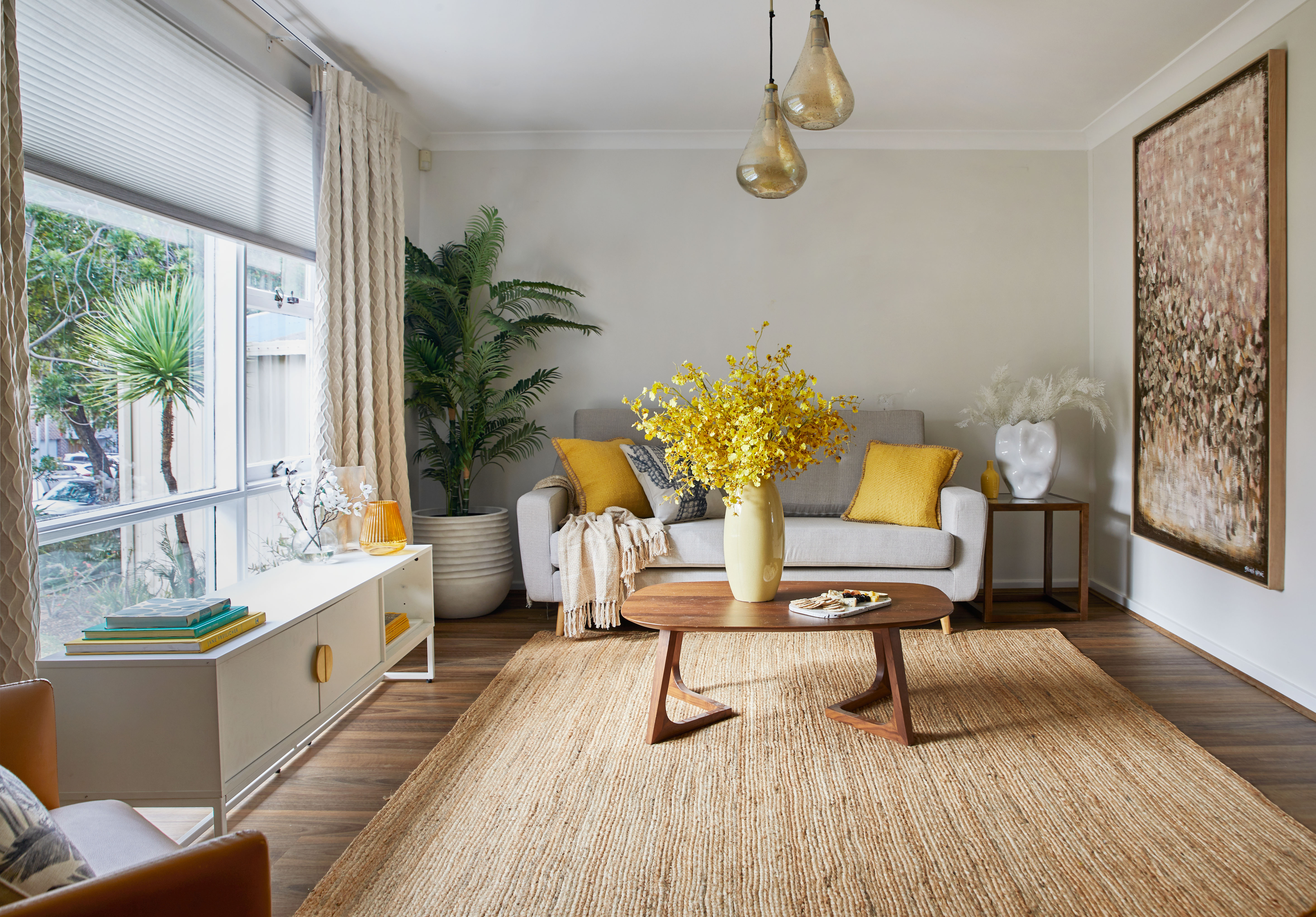
The walls throughout the home were created in a bright white, to create a fresh and modern feel—while various feature walls were wallpapered in a 1970s inspired palm pattern, which added warmth and sophistication.
New, hybrid timber flooring was also installed throughout the living areas of the home to make the layout feel more seamless and connected.
Luxaflex® Curtains were added in the living space, with an inverted pleat header, Treviso fabric and in Lustre colour—giving them a very stylish retro touch.
Luxaflex® Pirouette® Shadings were also added, in Satin Metallic fabric and Lightning colour. Pirouette shadings feature softly contoured, front-facing fabric vanes attached to a single sheer backing. During opening and closing, the vanes move in tandem for a fluid, graceful effect. Three-dimensional fabric vanes provide a striking and uniform interior look whilst softly filtering sunlight and providing privacy.
A bright, modern new kitchen was also installed in keeping with the existing layout, with bright yellow cabinetry providing a pop of colour. The team also built a unique and fun arched dining nook, with semi-circle dining table, to optimise the space and enhance the retro feel. Storage is always tricky in a small kitchen, so this new nook was also fitted with storage— including a pantry and broom closet, and drawers below.
The home included three bedrooms, all of which were of a decent size. Each room was given a facelift, with new carpet, paint and window coverings.
Luxaflex® Duette® Shades were used throughout the bedrooms, to add a sense of sophistication and style, as well as provide all-important thermal control. These innovative blinds have a unique honeycomb structure in the cells, which traps air and can keep interiors cooler in summer and warmer in winter. These shades were chosen in Elan fabric and Solitude colour.
A major drawback of this home, previously, was that the toilet was essentially outside— accessed only by the rear patio. This was the only element of the house that had been updated since 1960, when the original home wasn’t connected to sewerage mains.
Wendy re-designed the layout of the existing bathroom to include an interior toilet, and also added some luxurious new tiles and fittings to this space which also gives a design nod to the 1960s.
While set on a large block, the garden looked smaller than it was due to a closed-off patio, abundance of plants and an old unused birdcage in the rear. Over the years, this garden had accumulated plants and structures, and now lacked a sense of purpose and functionality.
The team cleared both the back and front yards, re-painted the exterior of the house, and laid new turf to transform the garden into a child-friendly space that would appeal to young families.
The back patio was also completely re-built and transformed into a far more enticing and usable space. In a nod to Wendy’s retro-inspired design, Dennis installed a 1960s style screen at the end of the patio, and painted it a bright yellow colour for consistency with the interiors.
The front yard didn’t need too much work. The house’s façade was repainted, and Dennis pared back the existing plants and replaced them with some more modern varieties.
While Richard and Corinne didn’t quite secure the sale price they were hoping for, they weren’t far off – getting $925,000, which they were able to put towards their new home in Canberra.
If you’re interested in finding out more about the window coverings used in this renovation, please get in touch with the team at Luxaflex today.
